


Pin Plaza
Advertising | Brand Visual Identityart director
mustafa khademsadeghclient
Pin PlazaProject Contributors
Negin Fallahi - Ayda AbbasiPin Plaza is more than a shopping destination — it's a landmark. This luxury commercial complex is located in Shiraz, a metropolis known as the cultural capital of southern Iran. To leave a lasting impression before its doors opened, Pin Plaza needed a cohesive visual identity: a brand that could make a place iconic before it existed. The visual identity system had to work at every scale — from interior wayfinding signage to service staff uniforms.
challenge
The local market had well-established competitors. Nationally, several prominent commercial complexes had already set the standard for luxury retail branding in Iran. The goal wasn't simply to look different... This refined and magnificent Iranian brand had to feel *inevitable*. Its brand image also needed to be shaped with intelligence and a contemporary sensibility. The process began with a thorough study of local and national competitors alongside successful international references, identifying the clearest opportunities for differentiation.
solution
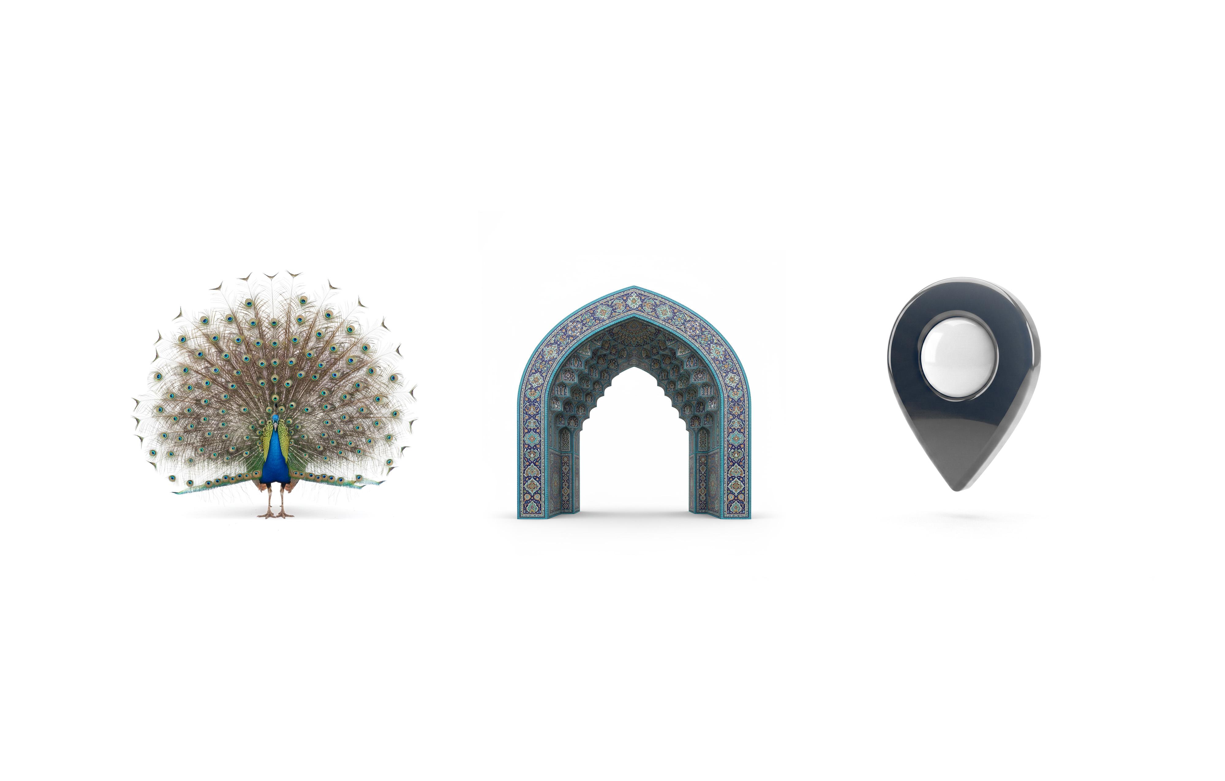
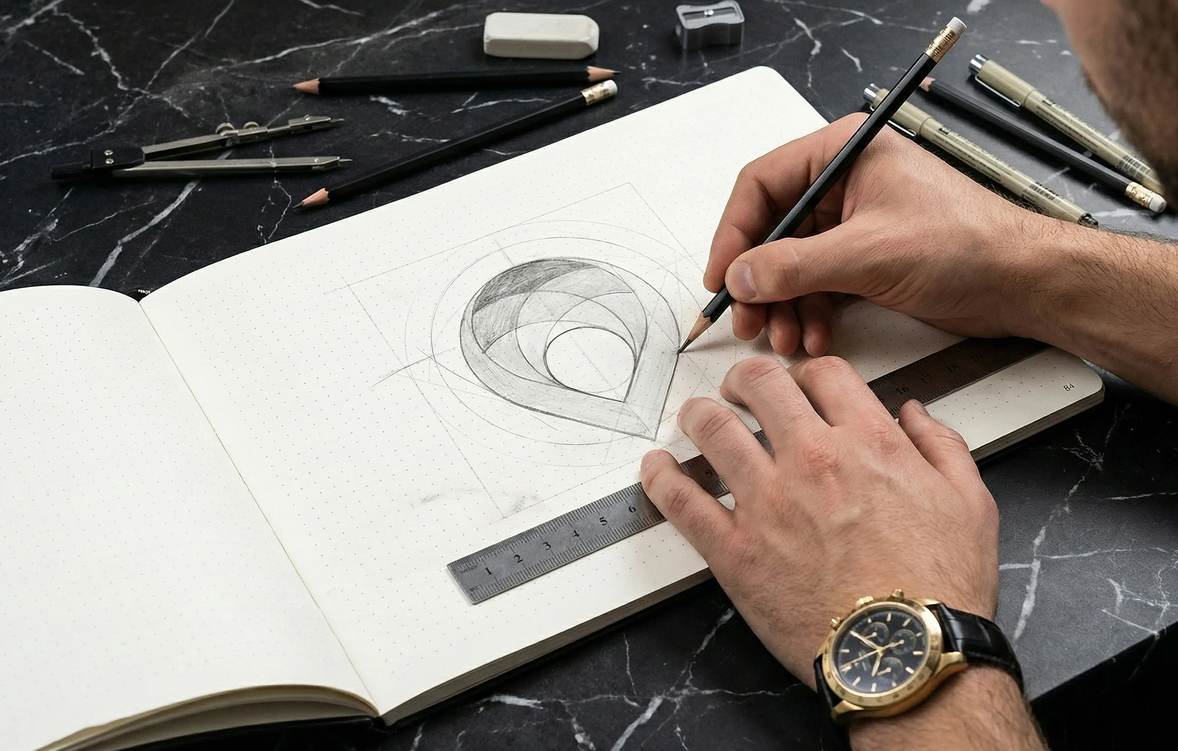
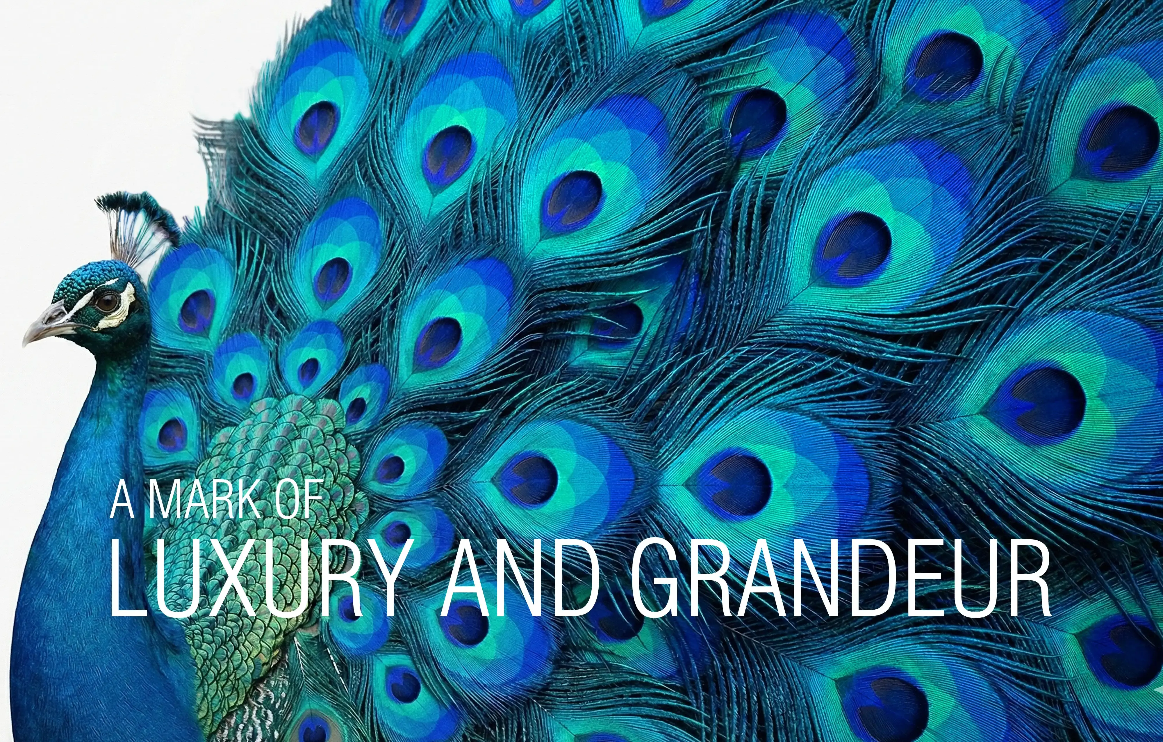
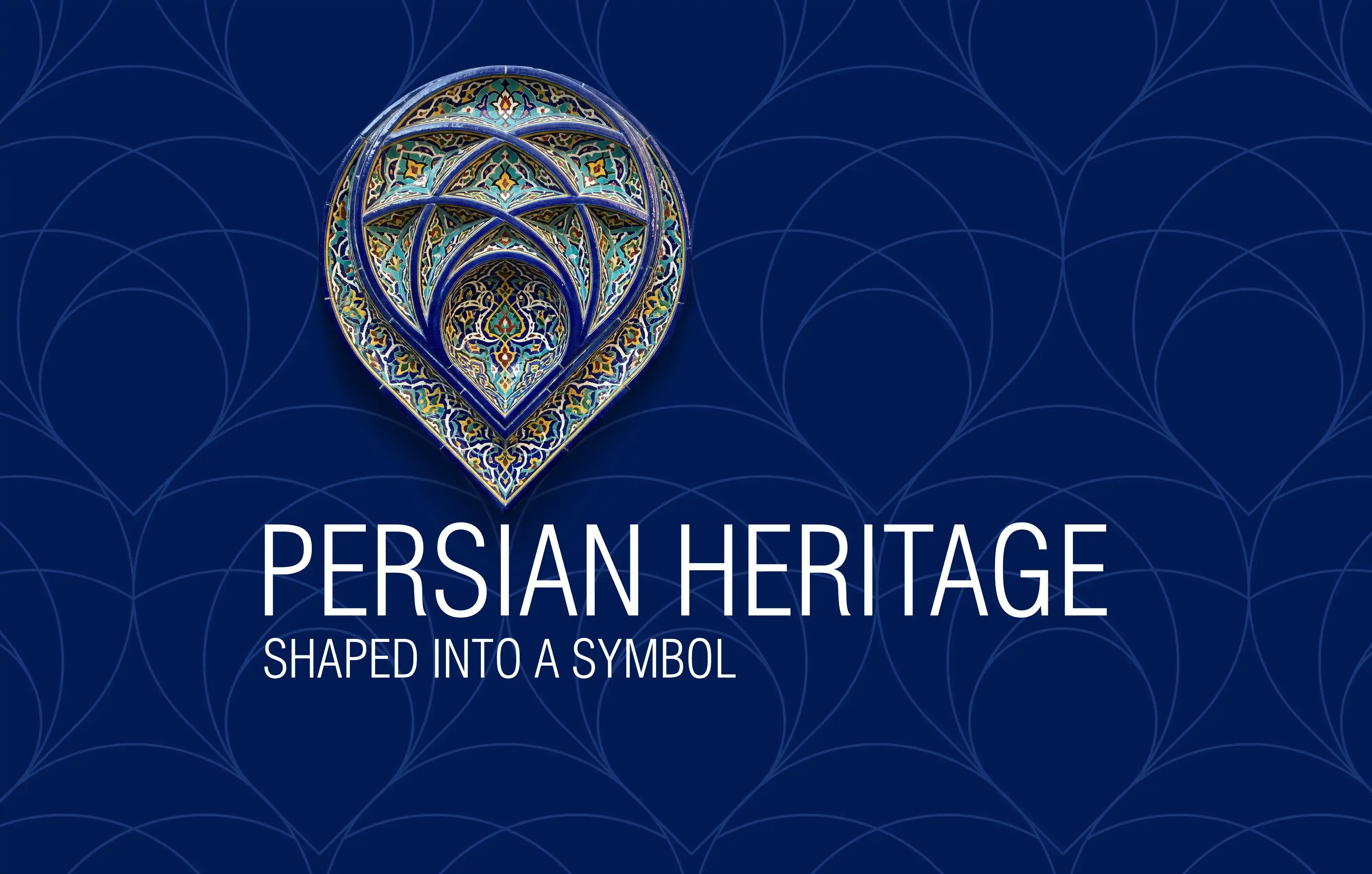
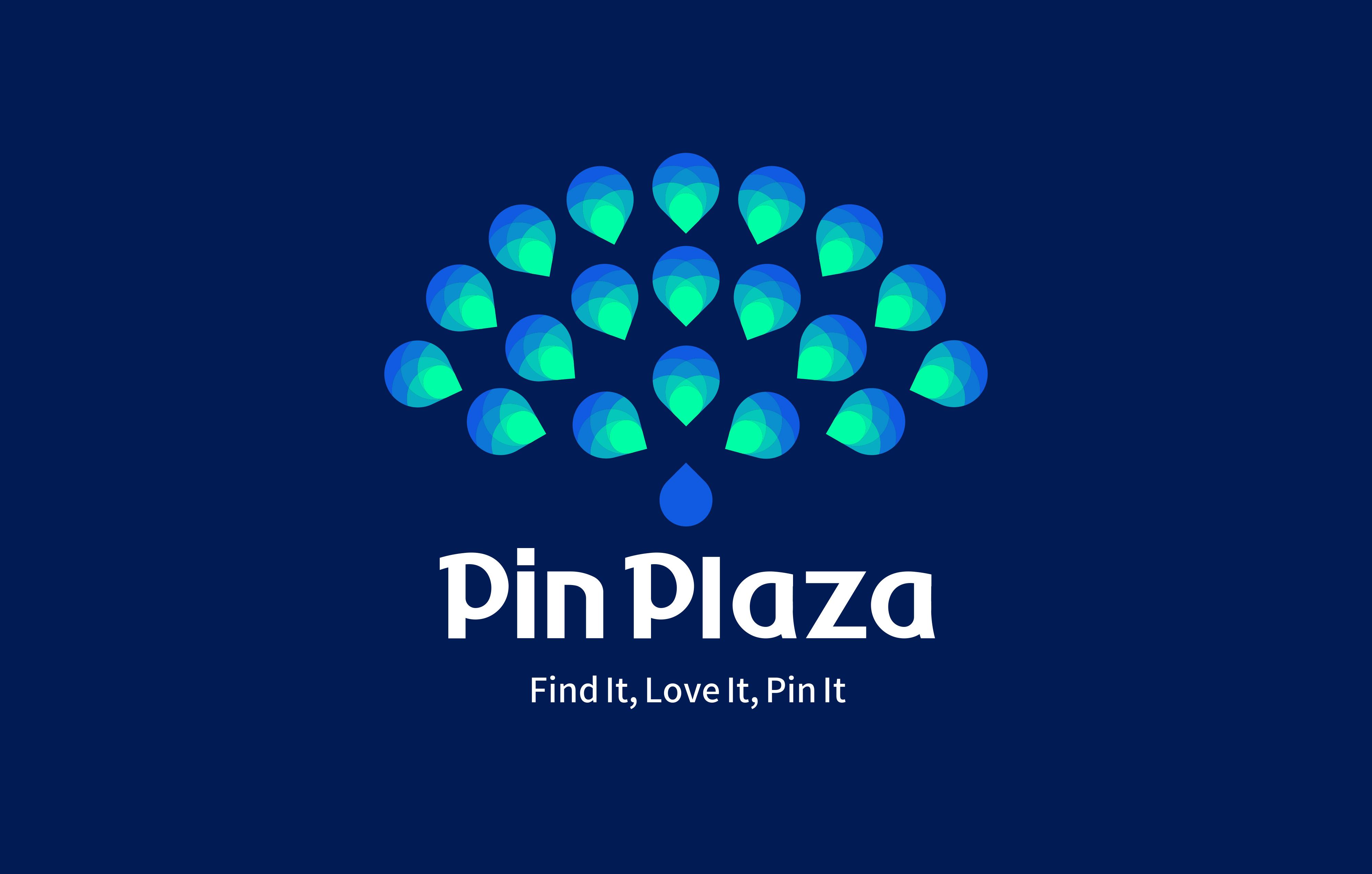
The mark's core concept was built around a pin — a universally recognized symbol of location — reinterpreted with fresh depth. Its silhouette carries three layers of meaning: the precision of a point fixed on a map, the grandeur, elegance, and opulence of peacock feathers, and the geometric richness of Iranian muqarnas.
Three references, one form.
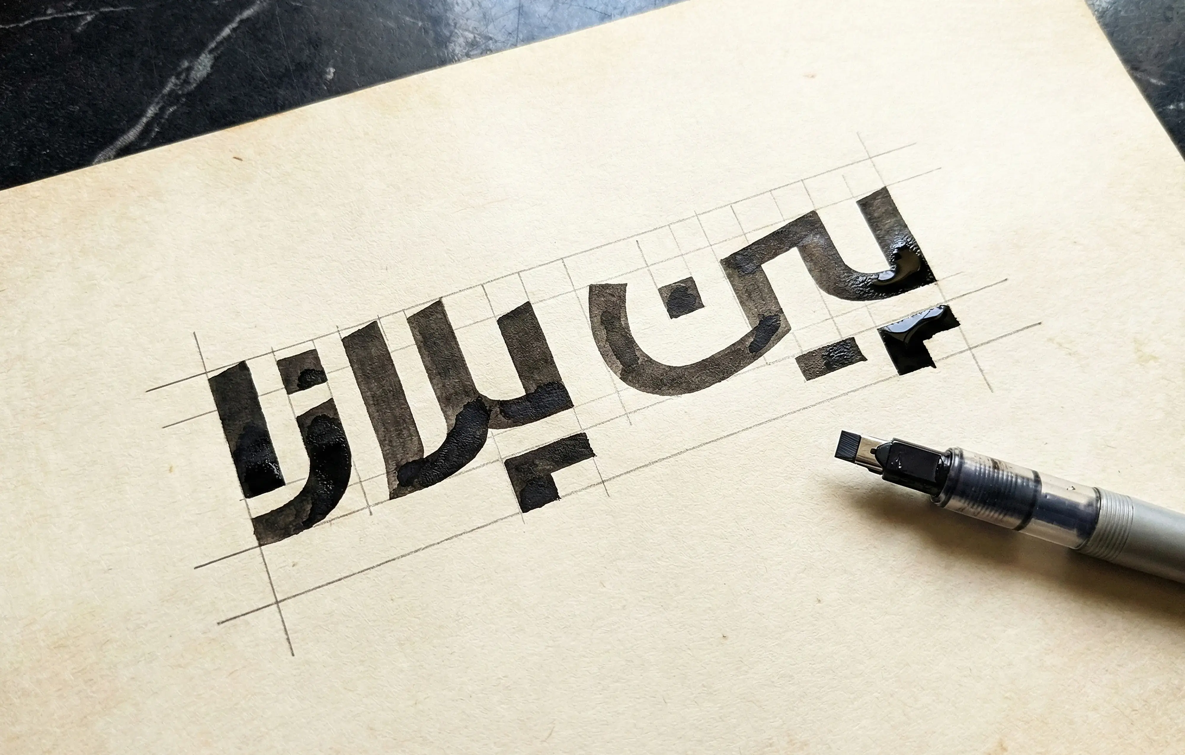
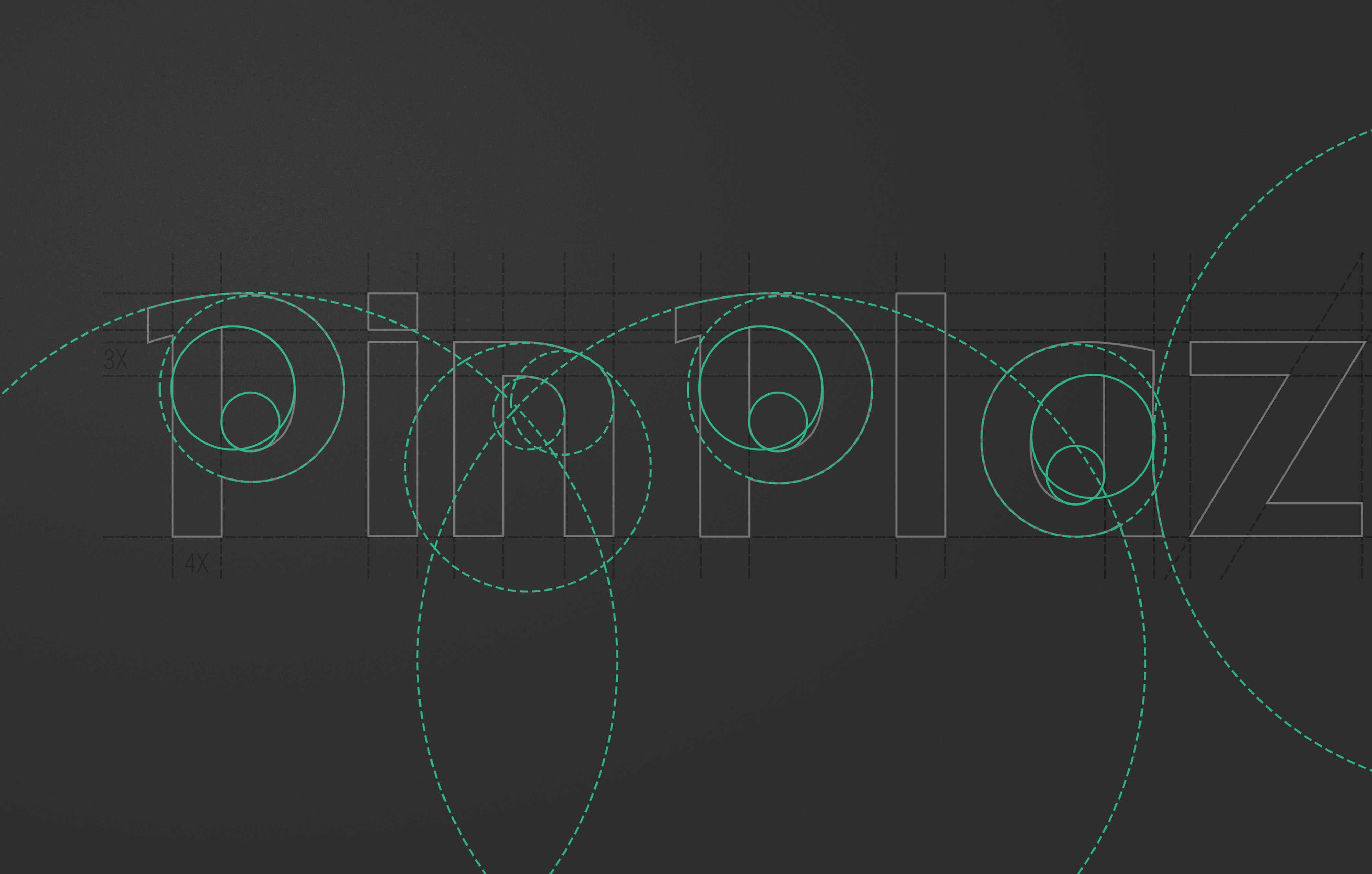
The Persian and Latin logotypes prioritize legibility. A subtle contrast between horizontal and vertical stroke weights delivers a quiet signal of luxury typography — felt before it's consciously noticed. The simplicity of the forms gives the brand a modern, intelligent visual character.
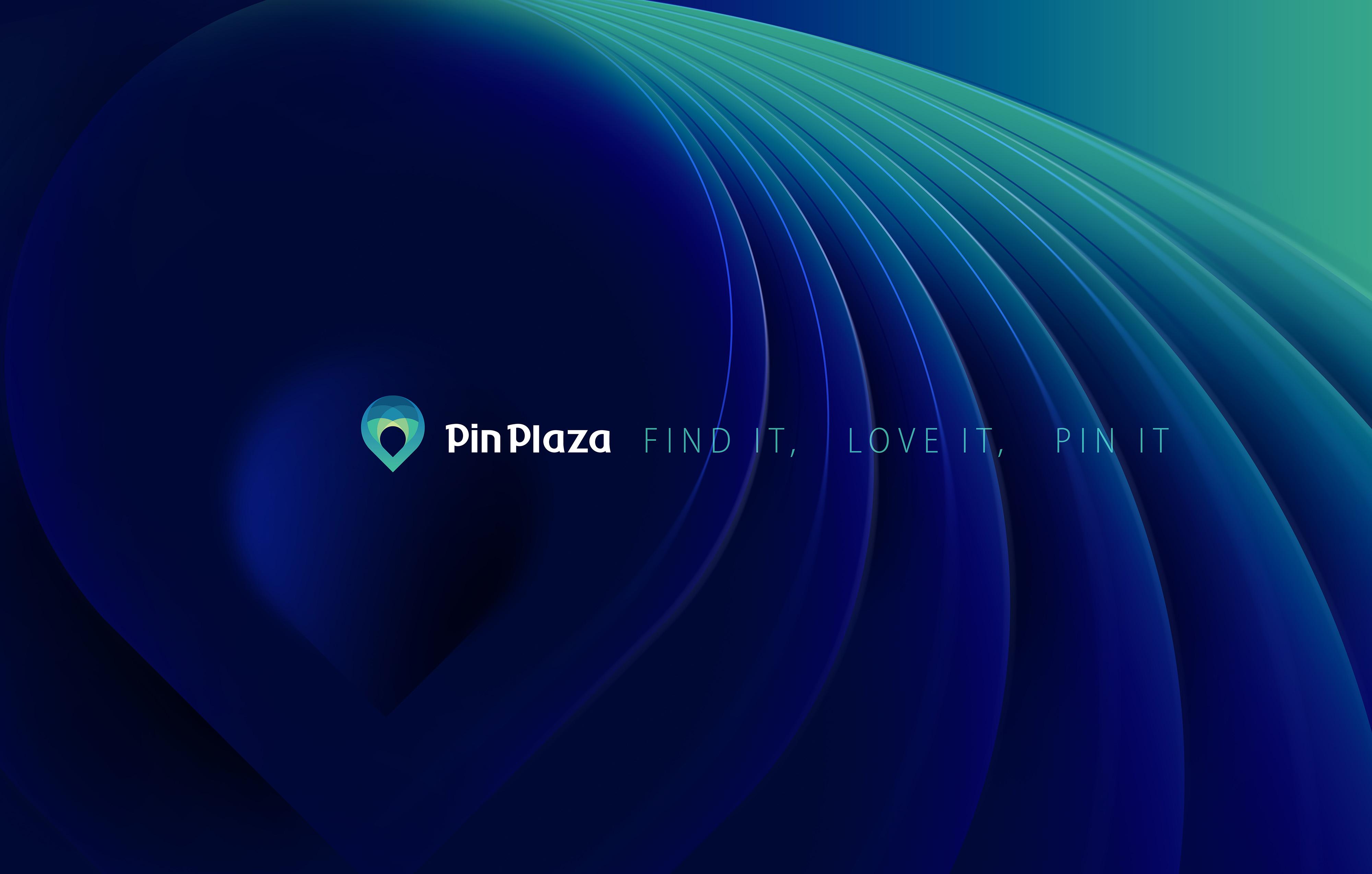
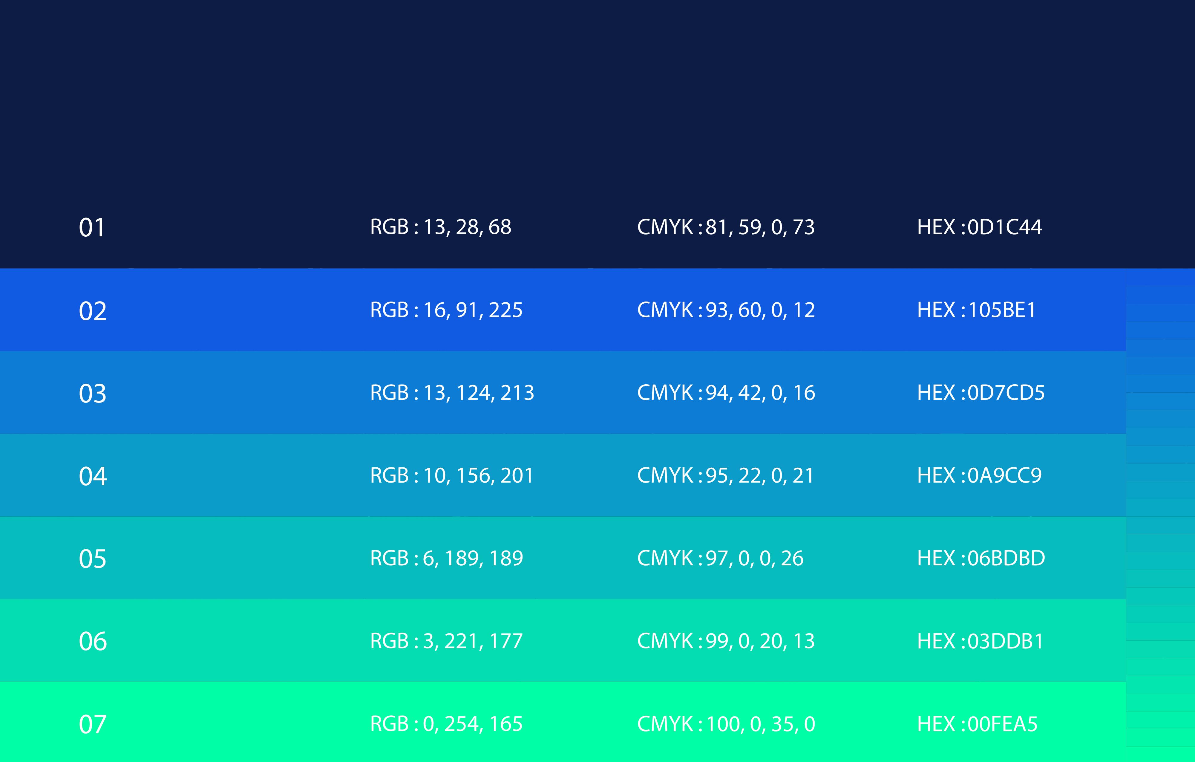
The color palette was built on color psychology principles: deep navy anchors the identity in authority and trust; turquoise brings freshness and distinction — a color rooted in Iranian visual culture with a universal language; lighter blues open the system for digital environments and large-scale applications.
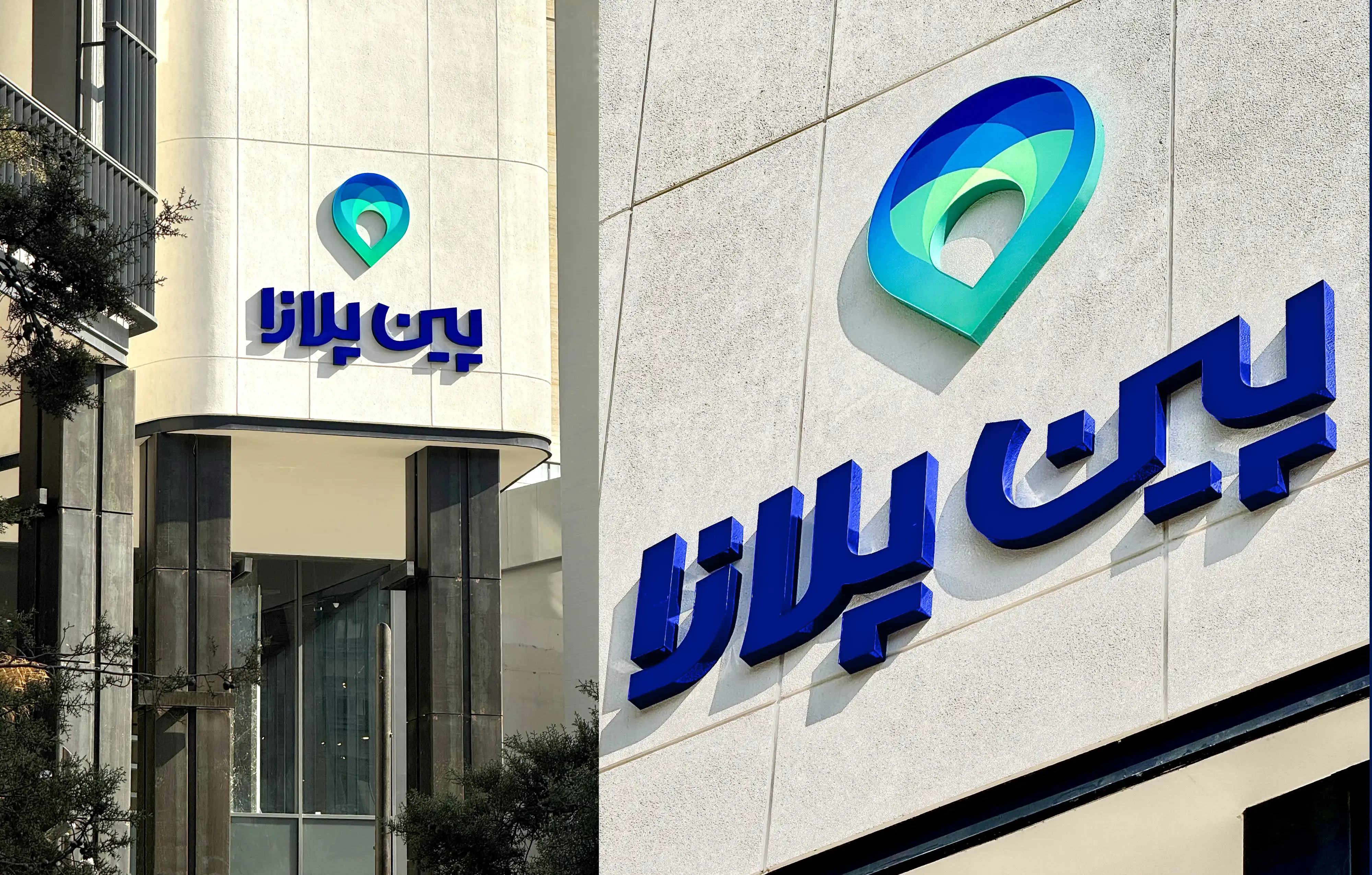
The professional visual identity was tested across every brand touchpoint: wayfinding and signage systems, construction-phase window graphics, unit fascia signage, informational boards, staff uniforms across four tiers — management, administrative, security, and service — stationery, financial documents, fleet vehicles, and all digital platforms and social media.


Other Project
Roya Gasht
logo | Visual Identity
Yaama Tech
Visual Identity